Type Considerations
I really like all these fonts as they are different to what you typically see on beer mats. So, I will experiment and see what looks best.....
Front Design One
This was my first initial design. I wanted the glasses to be hand drawn to make it feel more crafted!
I also incorporated some text which informs the viewer of a few facts related to alcohol binge drinking.
I hollowed out one of the glasses to see if it looks any better.
I found that it didn't & that I am not fond of this hand drawn design of the glass; I think something a little more crisp will improve the overall appearance immensely.
I then drew this glass; which is more refined. However, i still don't feel it looks as good as it could.
I incorporated the word 'today' into the design; seen as it is drinking more than 3 glasses of wine a day that will define you as a binge drinker.
I prefer this computer crafted glass much more that the hand drawn ones. I also removed the text behind the glass, this was to enable the other text to be the focus of the design.
After my progress crit, Jo suggested that I move the text to the opposite side in order to make the design more readable. So, I tried this and think it works much better.
With this one, I used a filled type layered behind the boldly outlined one. Nevertheless, I think it works better having the text striked through with the lively blue as it highlights it more.
Reverse Design One
I like this typeface as it is bold & enhances the fact that it is a serious situation the reader is being made aware of. However, I think it could do with something to make it a little more lively.
Therefore, I tried placing a pink background on the text but I don't think the block square does the image any justice.
So, I tried using the same strike/highlighting technique as before and feel this works a lot better within my design.
Reverse Design Two
This design highlights the 'did you know' to make it obvious that it is a fact being posed.
I didn't feel that the main bulk of the text was bold enough, so I block filled it black.
I also noticed that the web address wasn't very legible, so I changed the colouring of it, but this has resulted in it being even less legible!
Front Design Two
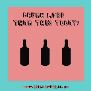
This is the statement I want to pose on this beermat design.
The web address definitely does not work in this colour so i am going to change this to black.
I left the text pink to contrast it with the black bottles and see its effect.
I didn't like the look of the pink typeface at all, so I changed it back to black and just block filled the front of the web address to make it more legible.
I felt this design looked a little plain and required some more colour. Despite my attempt with pink circle, I don't think it works very well as it cuts through the text.
After my progress crit, it was suggested to me that I put the number of units contained in each bottle on the bottle. So that is what I did. Needless to say, I am not happy with this design as it think the text on the bottle takes the attention away from the other text.
I added the extra bottle to this design as I realised it was 8 units that is considered binge drinking for men, not 6.
I like these colours against the black background. However, i think the layout needs a little consideration and development.
This variation looks a lot better and the change of colouring makes the 33,000 really stand out.


No comments:
Post a Comment