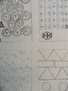
We decided to use posters to visually enhance the buildings aesthetics, as this was frequently mentioned in he feedback we received. As a group we decided to keep our posters simple, so chose to use only a circle, triangle and rectangle in our designs. Here are some of our design ideas:
In addition to this, we wanted to produce flyers which would contain our chosen pattern design but also offer the opportunity for us to explain to the public what the project was about. Therefore, we took into consideration how these could be distributed; attaching them to the boards near the posters was an idea.


No comments:
Post a Comment